Showing posts with label Assignment Four. Show all posts

Thursday, 24 May 2012

Preparing for Assessment – Assignment Four


This is another assignment that I felt less than satisfied with when submitted & the reasons are documented earlier in this blog.  Going back to the notes, feedback and images over the last week or so, I find it a bit of a mixed bag – some work and some don’t.  Paying particular attention to the tutor feedback on individual images, I have decided to make some changes for the assessment submission.  Three images were part of the original submission but have now been replaced and I have also changed the order.

This is the first that has been replaced.

I have to agree with the comments from my tutor – particularly about the man facing the camera mid-frame.  He looks uncomfortable and it detracts from the notion that this is a bunch of people having a good time in Holmfirth.  At the time, I felt that some of the alternatives were a bit generic, but I have replaced it with this one.

At least here there is some interaction going on; it confirms the notion of Holmfirth as a busy market town; and there is a little bit of colour & narrative.  The fact that it is generic is less of a problem since it would be appearing in an article about Holmfirth.

Next one for the ‘chop’ was this one.

It was doing its job in the original selection – illustrating tour guide Gary about his business – but shot quickly through the door of a coach it lacks any formal qualities and is technically suspect.  I guess the ideal would have been to go back and do more work on a Gary image – but I already had this one from the original shoot.  Properly caption, (i.e. explaining that this is Gary the tour guide, waiting for coaches to arrive at the bus station, something that he does every day, making this a familiar site in Holmfirth centre) this would also work effectively, and it has better formal and technical qualities – in my opinion.

Thirdly – again responding to tutor feedback, but this time a little more reluctantly – I have decided that this one can go.

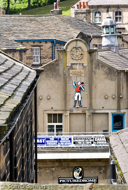
I don’t think there is anything wrong with the image itself, but the question raised was whether images of old stone buildings were being overdone and whether this actually adds anything.  Might there be another image that would introduce other aspects of the town that are not covered here?  It’s actually pretty hard to overdo the old stone bit in Holmfirth – it’s everywhere around you and creeps into most images.  However, I take the point.  One bit of Holmfirth history/culture not covered in the original images is the Picturedrome.  It’s an old cinema, that still performs that function as well as acting as a venue on the gigs circuit.  (Worth also mentioning that short silent comedy/feature films were being made in Holmfirth before they were made in Hollywood!)  So I have replaced the above with a similar image, but one that shows the Picturedrome and signifies its history – as well as its dual function as a rock band venue.

Making these replacements had impacted on the order of the images, both from a narrative and a ‘visual pattern’ viewpoint, so I will be presenting the order differently – but that will be clear from the prints submitted, so I’m not repeating all the images here.  As with the other assignments, several of the prints have also had a ‘tweak’ before submission and I have ‘rationalised’ sizes to two crop ratios.  There were several variations in the original submission and I recognise that this is an area where I need to be more consistent.
Another concern for both me and my tutor was that this series lacked any clear direction.  What was I actually saying about Holmfirth?  Where was the emotional expression?  I might have needed to completely reshoot in order to address that one, but I have recently had another opportunity to make a series of images about the neighbourhood, as my first assignment on Progressing with Digital Photography.  I deliberately made it a more personal view and the outcome is here.
Even more stone – must say something about me, perhaps?

Tuesday, 1 November 2011

Assignment Four – Feedback

I have now had the feedback from my tutor on Assignment Four and had the opportunity for some further dialogue.  Overall, the feeling is that I have done a solid job; planned well; met the brief; and produced a ‘good variety of thoughtful images’ that would ‘provide a good mix of illustrations for the magazine article’.

He commented, understandably, that whilst I had said that the town and the images have a ‘real mix of people’, the reality is very ‘white’ with few if any ethnic minorities.  That is a true representation of Holmfirth, on the whole, and my ‘real mix’ was more to do with the fact that there are still families around who have been farming the valley for hundreds of years, alongside others associated with the mills of the industrial revolution, combined with everything else up to today’s professional commuters.  But what the feedback does quite rightly demonstrate is that the perception of one’s images lies, ultimately, with the audience; and unless there is accompanying text to provide context or explanation, that audience will always read the images from their standpoint and their experience.

There were specific comments on individual images but also a suggestion that I might have one too many views of the stone houses – perhaps Image 11 could be replaced with something that added a further dimension such as the cinema or the water that I referred to in my notes, or maybe a night time image.  I think that is useful feedback and it is something I will give further thought to before my assessment submission.

The other significant overall comment, which I had picked up myself in my notes regarding ‘lack of emotion’, was that I didn’t seem to be expressing a point of view or making a particular statement about Holmfirth.  To be fair, I don’t think I set out to express a viewpoint, preferring (in the context of a magazine article) to reflect, without comment, and to document what I analysed to be the characteristics of the town.  The point to learn from this, of course, is that such an approach should produce a competent and thorough outcome for a brief such as this one, but it won’t necessarily result in a set of images that make an impact on the viewer.

I’ve been discussing Assignment Five with my tutor.  More in here later, but I hope that I am homing in on an idea that could have more of an emotional content that will contrast with and complement the more structured and shall we say detached/rational approach of the last two assignments.

Wednesday, 12 October 2011

Assignment 4 - Submission

Having made the final selection of twelve images, they have now gone off to my tutor, with accompanying notes.  The twelve are as follows & then I have included my 'Summary & Assessment', which went with the detailed notes in the submission.


My twelve images do, I believe, fulfil the brief, with enough range and variety to show the character of Holmfirth & its people and sufficient scope for a selection of twelve images to illustrate an ‘intelligent, thoughtful’ article in a travel magazine.

·         There is variety in terms of subject, scale and type.  I think there might, on reflection, have been more ‘detail’ type images but, as indicated in the notes, some do offer scope for cropping.

·         There is, I think, a good range of signs and indicators as to the nature of Holmfirth & the people that one encounters – not a comprehensive range necessarily, but then that would be very difficult to achieve in any circumstances.

·         Some of the characteristics I came up with in my planning, those that I particularly wanted to demonstrate, were rugged, busy, rather quirky, complicated, quite eclectic; and my images have a sort of ‘no frills’ feel about them, which fits with those characteristics.  My meaning here is that they don’t show a great deal of creativity in, for example, use of focus and focal length, camera angle, etc but this, for me, is a natural reaction to a rugged, no-nonsense, Pennine town.

·         Despite the variety of subject and style, I feel that they hang together successfully, and it is possibly the common theme of stone and stone buildings that supplies a visual link throughout.

·         If there is one characteristic from my list above that could perhaps have been illustrated more effectively it would be the ‘busy’ nature of Holmfirth.  It is there, in one or two, but there might have been ‘people on the move’ type images that would have given another dimension.

·         There are some aspects of the town that have not been illustrated.  Holmfirth has a historic link with cinema – both production and showing – which doesn’t appear; but I think a more important one is the river.  Water has been significant as a driver of the industrial revolution, as a source of destruction & death (three floods), and as a characteristic of the towns visual attraction today.  Water appears in one image, but there might have been more.

·         One positive worth mentioning is that people appear in nine of the twelve images selected, which is genuine progress for me and a direct reflection of the way my photography has developed during this course.  And I have already referred to the specific progress in creating arranged, posed portraits.

·         I wonder whether a picture editor would feel that there were enough eye-catching images; maybe the choice of ‘openers’ is limited to just two or three – perhaps relates to my comment above about use of creative techniques.

·         In reflecting on the series, I find myself making a comparison with some work that has featured a few times in my blog discussions – the ‘From Back Home’ works of Anders Petersen & J H Engstrom.  My blog of 23rd March 2011 contains some thoughts on this work and the reason I mention it here is that the series is all about a ‘place’ that is familiar to both of them.  In their case, they were producing a personal piece of work, reflecting an emotional expression of the part of Sweden in which they both grew up.  The key word I want to bring up is in that sentence – ‘emotional’.  I don’t think there is much sign of an emotional response in my images of Holmfirth.  The series reflects more of an objective, stand back and observe attitude.  That is, perhaps, appropriate for a magazine article, but could be a legitimate criticism of the series from an aesthetic or creative viewpoint.  As a general observation, and one I have made elsewhere, I think ‘emotion’ is often lacking in the work I produce – something to be aware of and to reflect on again.

This has been an interesting and useful exercise in which I think that I have successfully planned my approach around a brief; effectively moved forward in terms of my photography of people, including people aware and involved with the process; implemented the planning quite successfully; and produced a competent and workable set of images in the context of the assignment.

Tuesday, 4 October 2011

Assignment 4: progress report

I might, ideally, have blogged my progress on the assignment bit by bit over the last few weeks but, frankly, I havn’t had the time – work + OCASA + trying to progress the assignment itself.  The good news is that I am more or less there, with my 12 images chosen.  They need a little more tweaking for final print & then I have the notes to write, but I hope to complete that over the next week or so.  I’m not necessarily going to put my final choices into this note; it is more of a reflection on what I’ve done and how it has gone.  I havn’t ended up with exactly the pattern of images that I planned, but not far off.

These are the ‘overview’ images that made it to the long list.


The first two are ‘repeats’ of images that I have made before, with the first creating an attractive overview of the Holme Valley, the town nestling in the bottom of the valley and clear evidence of the textile mill history visible via the chimneys.  The second is a more intimate view from the other side of the valley, with an indication of the way the town is built onto the steep hillsides.  The ones that follow reflect an attempt to show more clearly the way the town sits at the end of a valley,  sometimes resulting in an almost claustrophobic feel.


The second of this group of three has some technical issues – not as sharp as I’d like, but it does reflect how the town centre feels closed in.  It’s interesting to note that I have often observed this sense when driving into the town from either of two directions.  When I went to take the photographs, I found that the view from the pavement was subtly different – and the middle of the road wasn’t an option!  The first and third above are both taken from a small piece of wasteland, just off one of the main roads, leaning over a temporary fence around a building site!

I planned to take some ‘people-oriented’ images and to make at least some of these portraits of shop/restaurant owners in the town centre.  I have done three such arranged images, in the end, as follows.  Firstly, the joint owners of Mezze, a town centre ‘eatery’ & bar.  I had the idea that my portraits might reflect ‘old style’ posing – the frontal, standing/leaning pose that one associates with early photography (necessitated by slow shutters, of course), which could also reflect Holmfirth’s roots in the industrial revolution.  At the same time, I wanted to make them obviously contemporary – not least by using colour.  That is exactly the approach I discussed with Adam & Sam, below, which I think they have carried off pretty well!

The building in the image below is one of the oldest in the town, dating back, almost certainly, to the fifteenth century.  It is what remains of a row of cottages that fell into the river.  It was, apparently, a pie shop back in the fifties, but its current use (and the one it has had for 40+ years) is very clearly signified in this portrait of another local tradesman.


Once again, he has followed my ‘brief’ very well, I think!

The third ‘arranged’ portrait proved a little harder to implement.  Gary is a tour guide.  He meets coach loads of visitors to the Holme Valley, by prior arrangement with the tour operators, and provides a commentary as they are driven around the local TV sites associated with ‘Last of the Summer Wine’ and ‘Where the Heart Is’, both of which have used the area extensively for location filming.  He also takes ‘on foot’ town centre tours to places like ‘Norah Batty’s House’ and ‘Sid’s Cafe’.  I was able to take a shot of him waiting, with his dog.  But, as soon as the coach pulled in, it was all action as he leapt on board to ‘sell his wares’, decked out in blonde wig, microphone in hand.  I felt a bit like the paparazzi trying to grab an image of a celebrity as he went about his business – then, the doors closed and they were away.


But I did grab this one, through the door of the coach – and it does have a ‘sense’ of place in the background, with the stone built weavers’ houses visible in the background.


I’m quite pleased with the way the ‘people’ pictures have turned out – reflects the increased confidence in asking people for portraits and then producing something reasonable.
In my planning, I also made reference to some images from this year’s Holmfirth Folk Festival; but I had another opportunity for something similar during September, with a Festival of Food & Drink.  The town has regular markets in the Market Hall on several days of the week, but this was a weekend festival, taking over large parts of the town centre.  I spent a couple of hours there on the Saturday, but was a little disappointed by the outcomes, which I felt were, on the whole, a little too ‘generic’ to be relevant to this assignment.  Here are a few of the images from the day, and I think the first, although still fundamentally ‘generic’, could work as an illustration of the fact that the town does host festivals and does, from time to time, get very busy.


I also planned a ‘heritage’ element to the selection.  There is some oblique reference to the industrial heritage in some of the images above, but the next few were specifically targeted in that direction.  The first is detail of a mill, including its name and date of opening – 1869 – and a terrace of cottages next door.  It is a good representative shot of the heritage architecture around the town.  The second is taken within ten minutes walk of the centre of town and shows a disused mill pond, with a brick built (unusual) chimney behind, and clear evidence of the contemporary use to which the mill pond has been put.  (I took this image with the full knowledge and involvement of the man fishing.)  Then the final one signifies the ongoing process of change in the valley – mill buildings recently demolished and the even older heritage of grazing land & dry stone walling behind.


Finally, I wanted to include other images around the town centre, some at the detail level and maybe one or two that included reference to the heavy traffic that passes through.  The first is a general image with quite familiar view that I have taken before.  It shows a familiar Holmfirth skyline, with the church tower and the cottages rising up the hillside behind it, but I have chosen to use a wide angle, which puts that view into the context of the small car park and bus station that sits immediately in front of it.  This where visitors to the town are most likely to start their visit and, on the right, is where Gary waits for his coach parties.  I quite like the way that the cloud is bursting from behind the church, on a typically blustery day.


Picking up on the car theme, the next is one that I actually took on one of my early ‘scouting’ sessions, but which I have never managed to better for an interesting image that also tells the story of Holmfirth’s battle with the internal combustion engine!  The colour makes it potentially effective for a magazine article, and I worked on quite a tight crop of the original, which makes the lorry seem to be almost upon us whilst at the same time dwarfing the people trying to drink coffee and eat ice cream at the pavement cafe behind.


Looking for detail led me to take the following two photographs, but they have turned out to have more than detail in them.


In the first, I was working on a shot of the old signpost and mileage sign on the side of one of Holmfirth’s two small bridges when these two ladies walked in front of it and then stopped to look over into the river.  One, obligingly, was wearing a striking purple coat, giving me a colourful composition with the brick wall and tree; but there is more in this image.  Notice the very narrow and uneven pavement that they are negotiating, and bear in mind that they are about 20-30 metres from where I took the previous image!  They are, by the way, typical of Gary’s customers.  In the second, below, it was the sign in the stone on the wall that I was targeting.  It indicates the height the water reached when Holmfirth was flooded after a reservoir collapsed in 1852 – and it clearly would have comfortably covered the two people who appeared in my picture.


Two more detail pictures below provide unusual views of familiar aspects of the town centre, and I could see either of these acting as useful ‘fillers’ in a magazine article.


The first looks down from the side of the church towards the old cinema, which still performs that very function from time to time and is also a highly popular venue for gigs, as demonstrated by the banner outside.  Then finally, there is this absolutely typical scene of the small cobbled streets and alleys around the town centre, which house a range of small shops that attract the visitors and which certainly provide much of the character of the town centre environment.


There are 22 images here, which is more or less in line with my guess at a 20 image long list.  They have been taken over about ten or twelve different sessions, including three for the portraits, of course.  Living close to the town and being familiar with it, I have been able to make quick, short term trips as and when I needed.  I think that, in here, I have the variety from which to make a selection that gives a ‘sense’ of the place that is Holmfirth and which would have the potential to provide some choices for a magazine picture editor looking to illustrate and article about the town.  The initial research has helped; for example, looking at the magazines made me determined to include some portrait-style images, which do usually and rightly for part of a photographic presentation of ‘place’ in its roundest sense.  Of course, knowing somewhere well and living close certainly helps – but it also makes the choices tougher.  I know that there could be a whole host of other possibilities and variants that I might have included.  Doing a similar set of images over a longer period would allow for more public events; more arranged sessions; more opportunities to demonstrate the variations that the seasons bring to a place like Holmfirth.

One of the key things I’m pleased about is that I successfully set up the ‘people’ sessions and carried them off in an OK manner.  I already knew one of the people at Mezze, but the other two were ‘cold calls’, so to speak.  That gives me a certain amount of confidence to go forward and do more of the same, which might be particularly useful for one of the ideas I have in mind for Assignment Five.

I won’t try and analyse the overall effectiveness of my set of images until I am making the submission to my tutor, but I’m reasonably happy with the way the process has gone.

Saturday, 27 August 2011

Assignment 4: pulling together a plan

This isn’t going to be prescriptive but I have a rough plan of how my 12 images could be made up, based on the thinking covered in my previous two posts.

The series might comprise:

·         1/2 broad images of the town, in the context of its valley and its surroundings; I have two potential locations/angles in mind and I know that the best light for one will be a.m. and for the other late p.m.

·         3/4 people-oriented images; not that these will be the only ones including people, of course, but people will be the main subject. I probably will include one from my Folk Festival series, already shot in the context of this course and with this assignment in mind.  Then I hope to go for portraits for the others – 2-3 arranged/posed; probably local shopkeepers, bar/cafe owners; probably outside their premises.  Finally, in this category, I might look for an image that focuses on the tourists.

·         2/3 heritage-style images – and I have plenty of subject matter to go at here, perhaps just re-shooting some that I have already done, but trying to get people into some of them, for added interest and an element of ‘interacting with place’.

·         3/4 town centre images; and again I have some specific ideas – a wide angle image including car park and church that I have taken ‘roughly’ before; something showing the heavy traffic, ideally interacting with people; an angle on the Picturedrome from behind the church contrasting old architecture with names of rock bands; and no doubt 1 or 2 others.

·         3/4 detail shots, for which, again, I already have some idea.

That adds up to 12-17 images and, in practice, I can see how I might end up with a long-list of about 20.

This, on the face of it, looks like a lot of pre-planning, but I refer back to the idea that Holmfirth is a complex place, a bit of an odd mix, and so conveying as much of that as possible in a series of 12 images needs some thought.  Ideally, I will get all of this done in the next month.

Friday, 26 August 2011

Assignment 4: Holmfirth – more research & planning

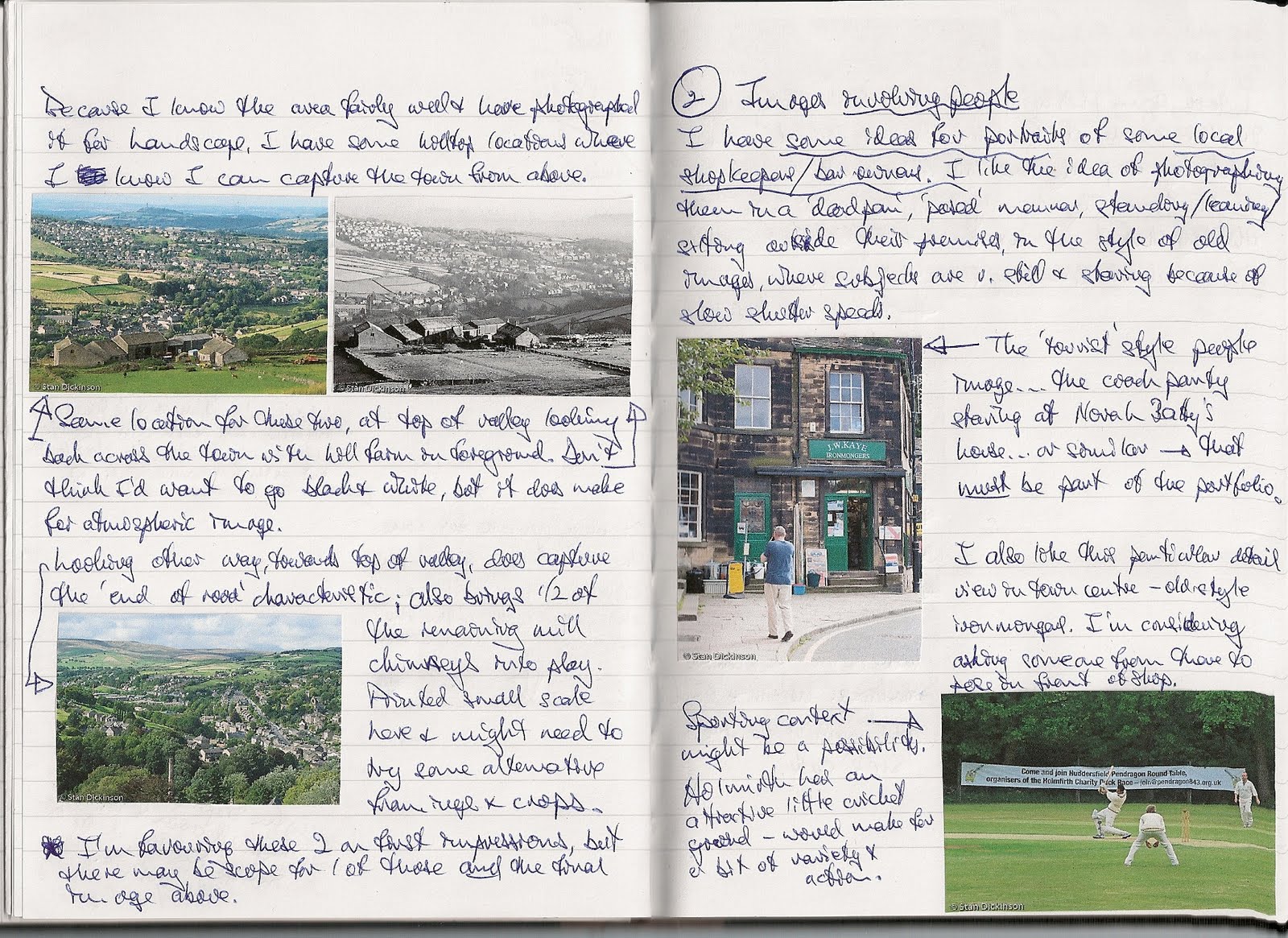
I have been keeping a handwritten notebook in parallel with this online log for People & Place and, in there, have been doing some more work over the last couple of weeks to plan my approach to this assignment.  Since the detail is in the notebook, I’m not going to repeat it here, but I have scanned one or two pages (below) just give some idea what I’ve been doing.

In line with the conclusions above, particularly the last one, I wanted to have some themes in mind, some view of my subject, Holmfirth, that I could have as my guiding direction with the assignment.  As a first step, I started to do a mindmap, following anything that came to me in relation to Holmfirth.  This was the result.


I havn’t reproduced it here to be read but just to show that it became quite complex & detailed.  We’ve lived in Holmfirth for more than twenty years, so I feel quite familiar with it, but perhaps too close.  I asked my wife to come up with three or four words that she associated with the town.  She paused for quite some time and then said ‘Hmm, it’s complicated.’  So, given where my mindmap ended up, ‘complicated’ seemed like quite a good place to start.  She then said ‘It’s such an ‘eclectic’ place’ – which gave me a second word.  My conclusion is that representing Holmfirth in a series of images is going to be more about variety and the representation of a number of themes than seeking one overall message (apart from complexity eclecticism!).

This complexity manifests itself, potentially, under a number of headings:

History & Tradition – the town/village has been around for more than 1000 years and has been very much ‘on the map’ since the last quarter of the eighteenth century when industrialisation arrived in a big way.

Change & Variety – the last 100 or so years has seen – textile manufacturing, followed by film production (early silent comedies, for example), postcard design & printing (the comic seaside variety), TV location (Last of the Summer Wine); tourism (largely as a result of the latter); arts and music.

Location – at the end of a steep-sided valley; in a scenic setting; equidistant from three significant conurbations.

People – valley-based, hill-farming families that have been here for hundreds of years; industrial worker families that arrived 200 or so years ago; some ‘moneyed’ families associated with ‘ownership’ of latter; some artistic types; and in ever increasing numbers over the last 20-30 years, commuters/professionals and their families.

To that one can add that it is an exceedingly busy place, rarely quiet, with streams of traffic (including heavy vehicles crossing the Pennines), regular coach loads of visitors, an increasingly popular rock music venue, and some very popular bars & pubs that keep things buzzing into the early hours.  Also, one has to say that it has a ruggedness about it – not necessarily quite the right word, but it certainly isn’t genteel – not the architecture, not the people, not the climate and not the landscape!

Having lived here for 20+ years, I’ve already taken lots of photographs of the place – naturally. I will, of course, be taking fresh images for the assignment, but researching what I’d already done seemed like a sensible starting point.  I’ve been selecting all sorts of ideas and have then pasted them into my notebook, under various headings.  It is, I guess, the equivalent of doing some preliminary drawings before designing something, producing an artwork or whatever.  I’ve scanned and reproduced the pages below – again, not to make them readable here on the blog but to illustrate my approach,


It has certainly been a useful exercise and whilst it hasn’t (and wasn’t intended to) produce all the answers, it has given me some very clear directions I can go, as well as pointing up some obvious gaps (pictures involving people, for example).  I do now have a good idea of how the series of images will be structured, but I’ll post that as a separate item, since this one is getting very long.

Thursday, 11 August 2011

Assignment Four – Initial thinking & research

After getting somewhat wound up over the brief for the last assignment, I decided that the first thing I’m going to do with this one is to take a close look at it.  I’ll get a bit of thinking and analysis out of the way at the start so that I have a clear idea in my head as what I’m trying to achieve.  That said, since this one is about producing images for a ‘thoughtful travel publication’, I don’t think I’m inclined to go off and do my own thing either.

The title of the assignment is ‘A sense of place’, so everything is going to be geared towards that overall objective.  It is not to be about promoting tourism, but a ‘considered, in-depth treatment’, so a degree of sophistication is required.  There need to be at least 12 images, but in the context that only about six might ultimately be chosen by the magazine – so no good producing twelve that all need each other; the images need a certain amount of autonomy.  But there is also a strong emphasis on variety – visual, subject and scale.  The aim is to ‘show the character of the place and of the people who live there ...’ – in other words, to create a ‘sense of place’.  The brief also mentions drawing together ‘camera handling, observation and reaction...’ – so demonstrating an element of ‘technical’ capability (in the broadest sense) will be important.

I decided that getting my hands on a few travel publications might be a good start – albeit they aren’t all necessarily in the ‘thoughtful’ class.  I’ve looked at four magazines.

National Geographic (August 2011) – I suppose, this would be regarded as the archetypal travel magazine.  It is a very long time since I have looked at it, though it hasn’t changed a great deal, including maintaining its small size. The only ‘place’ feature in this edition was an article called ‘Land of Shadow’, about Myanmar (Burma).
·         Comprised 24 pages of the magazine, with approximately two thirds of the space devoted to photographs.  15 images in total (so an average of about one page per image) but in sizes ranging from ‘double page’, through full page (both in portrait format and in landscape, spreading across two), to half page.

·         The images are credited to Magnum photographer, Chien-Chi Chang, and I was particularly struck by the variety of subject, style and scale.  There are people in most of them, though their presence is itself in quite different scales and serving different purposes.  The subjects range from the slightly sinister and threatening, through people at work or in the street going about their lives, through landscapes, where people serve as the ‘accent’, more ‘recreational’ activities, then the military on the march, girls in a ‘fashion’ show, a man suffering from AIDS, children begging and a domestic scene.

·         Scale varies from two full page ‘intimate’ scale photographs of contrasting images on mobile phones to wide angle vistas.

So, in the context of the assignment, there is an important lesson about variety – and that is variety in all aspects, not just subject matter.  And, also worth repeating that almost every image includes people, even if they are ‘secondary’ to the subject matter.

Lonely Planet (August 2011) – this isn’t a magazine I’ve ever looked at before – published by the BBC, though it doesn’t carry a BBC logo or any obvious branding.  Page size is about 50% bigger than NG.  I suppose it is a direct competitor, though the style is a little different – more, shorter articles, in general.

One interesting concept, derived, I guess, from the bigger page size, is the regular use of what one might describe as a one-page picture essay – typically six images on a page, but in varying sizes from quarter-page down to about 3cm x 2cm (usually a highly selective detail).  Whilst not necessarily immediately easy on the eye, and certainly not helpful in appreciating the detailed merits of a particular image, it does work well in creating a quick ‘sense of place’.

There was one ‘place’ feature on Namibia, which I looked at in a similar way to the NG article.

·         12 pages with a total of around 2/3 of the space devoted to photographs again.  Photographs credited to Mark Read (http://www.markreadphotography.com/)

·         Picture sizes ranged from double-page spread (1), through near double spread (1), full page images (2), one-page compilations at nine to a page (2), and then a series of very small images in a ‘step-by-step’ guide.

·         Subjects go from a ‘pure’ landscape image of desert sands, through wildlife images, to 3 children posing in a dead tree, and an ‘atmospheric’ portrait of a woman.  There are two or three portraits in the ‘page essays’, plus more wildlife shots, a full landscape, and some ‘intimate detail’ shots.

There is another feature on the Western fjords of Norway, which has a similar overall structure and, once again, a number of posed portraits.  Images by Justin Foulkes.

I took a quick look at two other magazines, neither of which falls into the ‘thoughtful’ category.  Discover Britain is more touristic in its style, with less depth.  There were a couple of ‘place’ type features in the September edition, one on Highgate Cemetery and one on Liverpool, where the concept of variety was prominent again.  Yorkshire Life certainly doesn’t fit the travel category, but I chose to look at it for comparisons in the treatment of Yorkshire towns and villages.  Again, articles were shorter, with less depth; some use of the ‘single-page’ essay as in Lonely Planet; plenty of people shots, but often ‘named’, very posed, and a hint of the ‘snapshot’ about them – a characteristic I would apply to many of the photographs in this magazine.

Also of some relevance to this assignment is the recent Michael Freeman articleon WeAreOCA.  I take three particular messages from this – the level of planning and preparation that went into the feature; the fact that several shots were pre-planned and set up for the purpose of the article; and that there was a point to the feature, something they were looking to communicate.  Regardless of whether one agrees or disagrees with the ‘political’ element underlying the third of these, having a direction, something you want to say, even something as general as a mood, provides focus and direction to the images produced and is likely to ensure that they work effectively together as a set.

In conclusion:

·         Very useful to get a feel for what the magazines use; how images are presented and laid out.

·         It is important to go for variety of 1) subject (and to include some/several people images); 2) scale (including some ‘intimate’ scale shots that can be printed on a smaller scale; 3) genre (with, ideally, some ‘documentary’, some ‘landscape’, some ‘portraits’, some ‘action’, and so on).

·         Must look for ‘different’ and ‘creative’ opportunities as anything else can soon end up like just another set of ‘snaps’.

·         Having a general theme/purpose in mind will help to give direction and cohesion to what I do.