Thursday 16 December 2010

Assignment One: A portrait

This first assignment requires that we take one subject and produce 5-7 images of that person, in different types/style.  My subject is Isobel, and some of the following are from projects completed in this first section of the course; others are from different sessions.

This first image is taken, on location, at one of the places identified in Project 2.  I must admit that, when I saw this potential location, it was the contrast between the textures of the site and the texture of the human face that I had in mind.  This head and shoulders portrait highlights that contrast successfully, I would say.  The softness of skin texture, the light smooth shine on the lips, the gentle waves in the hair, the slight highlight in the eyes, and the warm tones of skin and hair, all contrast markedly with the rough, hard, decaying textures & colours in the stone background and the crumbling green/rust/red down-pipe.  Lighting is primarily from a diffused, shaded afternoon natural light, supplemented with a small amount of on-camera flash to fill-in the face.  We worked on a few options in terms of posing, but I think that this gaze to the left of frame, combined with a gentle smile has resulted in a somewhat dream-like look that suits the slightly surreal contrast of texture/context mentioned above.  The smile and warmth of expression in the eyes offer some ‘reassurance’ to the viewer; whereas a more serious, even startled look, could, in this context, have produced a more disconcerting image.  It would have been possible to portray a sense of threat, for example.  I am also reminded, to some extent, of (black and white) images of Hollywood starlets in the 40’s & 50’s, in which they were often portrayed looking upwards and out of the frame; a type of portrait beautifully copied in one of Cindy Sherman’s self-portraits, of course. As a portrait of Isobel, however, it works well in highlighting her features and her hair, whilst adding interest through the slightly surprising context/location.
The second image is taken from a session that Isobel and I shot for Project 2 (we called it the ‘catalogue session’ because we felt the outcome had a look of ‘Littlewoods’ about it!).  A full length portrait this time, it is shot from a slightly elevated position with the subject looking up at the camera, lit by diffused natural light.  The soft, ‘all-over’ light has worked well, I believe, in producing relatively low-contrast image of Isobel in which all facial features, dress etc are evenly balanced.  Although we did spend some time trying different looks etc, I like the relaxed, naturalness of the stance, facial expression, and of course, the gesture with the left hand.  The crop provides a good, balanced framing of the main subject, through the tree branch top left, foliage bottom left, and leaves to the right; and the colour contrast with her clothing works successfully too.  The metal platform, on which she is standing, with its large nuts/bolts, adds another level of overall interest to the image.  As I said above, it does feel a little bit like a catalogue illustration, but it works as a pleasing portrait of Isobel as well, hopefully!
This high contrast, closely cropped facial portrait is quite different.  Also shot outdoors, it is lit by bright afternoon sunlight that is shining over my left shoulder and being broken up by trees; hence the shadows on the face and the considerable tonal range.  We had to work at finding the right position so that the eyes were not in shade but where there was enough shadow for it not to look like a dirty mark on her face, or war-paint!  I made the conversion to black and white in Photoshop after seeing the image on screen; and I did it because I sensed that it would be a particularly effective way of using the high contrast in this picture, which I think has turned out to be correct.  The image is, of course, very dark on the left of frame, almost black.  There is a fair amount of ‘information’ in the shadows in the original RAW file, and I did try versions where that shadow detail had been brought out, but I prefer the very high contrast in the monochrome version, especially since it is balanced by the brightly lit hair on the right side.  The highlights in the eyes and on the lip work well, but I have to admit that I only spotted the one on the ear-ring afterwards; perhaps some sixth sense made me capture it anyway!!  The image has quite a serious and thoughtful feel to it.  The shadows on the face, plus the tiny hint of a frown line, and the gaze directed off frame into the distance, suggest the possibility of something on the mind (other than, can we get out of this bright sunlight, it’s hurting my eyes!).  There is a ‘mature’ sense that differs from the gentleness of smile and expression in the first two – and that is also, in no small part, due to the lighting, the crop, and the mono-conversion.
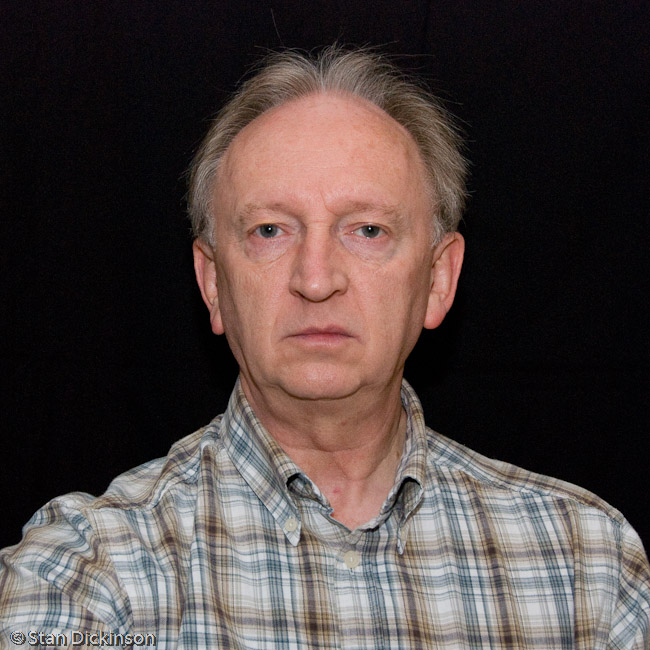
This portrait is from Project 6,’Best of a sequence’, and it is, for me, the best in this sequence as well.  I have written elsewhere in my blog about my interest in the ‘deadpan’, contemporary photographic style, and this is my ‘take’ on it.  I took some care to select a background that would have as little impact on the image as possible, and then experimented with lighting that would achieve a consistent, soft and ‘low impact’ feel (a ‘bounced’, diffused, off-camera flash, as explained under Project 6), eliminating shadow as far as I could.  There is a very soft shadow behind the lower part of her face, but I came to the conclusion that this was actually quite useful in introducing just a small element of depth to the image.  I deliberately went for the frontal ‘pose’ but asked Isobel to have as little expression on her face as she could.  There is, actually, a hint of a smile, but it seemed to work more effectively than some of the others that almost had too serious a ‘stare’.  I wanted to pare the portrait down to some very basic essentials.  The near symmetry of the pose, facial expression, dress, is accentuated by the simple square crop.  It is, of course, perfectly obvious that Isobel is ‘posing’ for a portrait photo, but I have tried to get as far away as I could from any sense that she is ‘putting on’ a pose.  I want the image to engage the viewer and make him/her want to look, but I’d also like them to wonder what it is about this very simple image that makes them look.  Not sure whether it achieves that, but it is my own choice from the sequence.
In complete contrast, here is Isobel far away from any form of photographic pose.  In one of two ‘action’ portraits in the selection, she is seen with her two horses, leading them out to the field, on what appears to be a cold winter’s day.  I took a number of pictures of her outside in this context – mending a fence; spreading hay on the snow for their feed; taking the horses through gates; breaking ice on their water buckets – but I have chosen this one, even though we don’t actually see much of Isobel herself at this distance.  The low winter sun makes for an attractive light, but the presence of snow, the rugs on the horses, and Isobel’s own clothes tell us that this is not necessarily a comfortable day on which to be out and about.  The three of them make an attractive grouping, but we can also sense that one of the horses is less willing than the other.  The slight turn of Isobel’s head and the expression on her face (just visible, even at a distance) tell us that she is encouraging him, and the position of her left arm also suggests that she is having to pull him along to some extent.  I like the comparison between the previous image and this one.  The former, fully face-on and looking straight at the viewer, might be assumed to tell us a lot about her, fully-exposed to the camera’s gaze.  Actually, this portrait, in which she is relatively small in the frame, clothed in thick winter garments from head to toe, and only letting us see the lower part of her face from many yards away, has so much more to say about her.
The final portrait, another ‘action’-based image, is also from within the ‘horse’ context, but we wouldn’t necessarily know that without the clue from the previous one.  This is taken indoors, in a stable, in low ambient light, using an on-camera flash unit.  I spent some time capturing a range of photographs of Isobel as she cleaned out the stables, and several might have formed part of this set.  I have chosen this one for a number of reasons.  Firstly, I like the composition.  There is a touch of the classic ‘thirds’, with a vertical line implied by her downward gaze, and a corresponding horizontal formed by her right arm; but there are various other interesting compositional lines – the rake handle; the diagonal wooden support in the background; metal verticals, wooden verticals etc.  Then, there are some specifics that I think provide interest – the pursed lips; the hand gripping the end of the rake and the wrist angle; the concentration of her gaze.  Most importantly, I want the image to provide a narrative interest and stimulus for the viewer.  It shows a young woman very clearly absorbed in some form of manual activity, concentrating hard, tensing her face and muscles, not actually posing yet almost seeming to adopt a pose anyway.  Her smooth skin and neat hair are in contrast with the cobwebs, old wood, blue binding string, piece of plastic packaging etc lying around in the background.
Overall, this set uses a variety of styles to show several aspects of Isobel and her life.  It isn’t a comprehensive ‘portrait’ and there are other images that I would have liked to include had time and opportunity allowed – a more ‘formal’ portrait, for example, with Isobel smartly dressed to go out for the evening; and at another extreme, something informal that showed off her sense of fun and humour.  I may even add these later, but it has proved difficult to arrange suitable opportunities.

Monday 13 December 2010

Project 8: Varying pose (Part 2)

The project was completed in one 90 minute session, with Phyllis as my model (thanks for your help, patience and co-operation in the process).  We worked on three basic ‘sitting’ poses, with multiple variations of hand position, body angle etc within each; and on two basic standing/leaning poses, again with multiple variations within each.  Working from around 100 images covering 40-50 different variants, I have selected the following.
Firstly, five variations of pose whilst sitting in an armchair, including some in which we used a book as an additional ‘prop’.  All five seem to work successfully and the book certainly seems to help ‘relax’ the hands, as well as supplying a narrative element to the images, particularly the last one.  The crossed legs position was retained throughout the first five because we felt it was the most natural and relaxed when the subject was leaning back in the chair.
The next batch is again based on a sitting position, but this time behind a dining table, as though engaged in a meal.
Interestingly, although initially designed to produce a more informal feel to the portraits, it is probably those with a more formal posing position that work most effectively, for example the first and the last of this sequence.
The third sitting pose mimics one that I had seen a number of times in magazines, looking over, and leaning against, the back of a chair. I think that we probably got the best sequence of all from this basic pose.  As illustrated, the back of the chair presents opportunities for many variations on hand positions, of which seven are illustrated here, but we tried one or two others as well, which were less successful.  Thinking about why this pose works well – facing the wrong way in the chair lends an air of informality, for a start; then, as mentioned, the hands are probably more comfortable than in most poses; turning the upper body will tend to tighten the muscles and draw the subject towards the camera.  I noted in ‘Part 1’ of my notes on this project, that some ‘celebrity poses’ have the look of yoga about them.  The top right pose in this sequence has a little bit of that feel about it.  We noticed that the relative positions of the hands/arms in that particular pose didn’t look or feel entirely natural – but interestingly, it works quite well in raising the face to the camera and creating a compositional line from bottom hand up to the face.
We then moved on to two standing positions.  In the first, Phyllis has put on a coat and is standing by a door.  Again, I thought that a degree of narrative would help the eventual outcome and also lend some credence to different poses adopted within the basic one of ‘standing by the door’.
Apart from the fundamental issue of ‘Is she preparing to go out, or is she posing for a photograph’, the key difference between the poses is hand position again.  Of course, as observed in looking at the Rineke Dijkstra portraits earlier, when standing immediately in front of the camera for a full length portrait, especially with a frontal facing pose, the subject is likely to feel some uncertainty as to where their hands should be.  I give direction for most of these variants and, rather like the last set with the chair back, if the hands can be occupied with a door handle or hidden in a pocket, the subject is likely to be most at his/her ease.  The last two illustrate the ‘by-the-side’ issue.  In the first of those two, I simply asked Phyllis to put her arms by her side.  The fingers are tensed, not quite sure whether to face stiffly downwards like a military pose, or to clench into a fist.  In the final image, I specifically said ‘relax your arms and hands as much as you can’; and I feel that the overall result is more relaxed than the one without that direction.
The last sequence of images retains a standing pose, but this time with an element of ‘leaning’ – against a tall chest of drawers.  The leaning aspect makes it easier for a subject to retain the pose and, rather like looking the wrong way over the back of a chair, tightens the muscles whilst introducing the ‘informal’ element again.  There is an opportunity to vary hip position, too, which we didn’t particularly explore here, but which is evident in the bottom left image.  The last images was a bit of spontaneous fun in which Phyllis was mimicking the pose of the angel in the little statue on the chest of drawers.
The project confirmed that there are any number of variations of detailed pose within any one overall positioning of the subject.  It is useful to have some basic ones in mind before a session, but some degree of on the spot creativity and thought is desirable – including working with the subject to understand what feels natural and comfortable to them.  Providing the subject with something to do with their hands helps to make the portrait more natural and relaxed, but I think I can also better understand the efficacy of the ‘celebrity pose’.  Turning, twisting, tensing muscles, introduces a greater element of muscular control, which probably helps the subject to hold a pose, however ‘unnatural’ it might look.
I have chosen the image from each of these sequences that I felt worked most effectively, as follows.

Interesting – none of them is a ‘classic’ frontal facing pose.  To be fair, we didn’t do many of those because of the very nature of the project, but I think I’ve learned something here.  In the context of ‘contemporary’ art photography, the question of the ‘pose’ and theories about what it means are interesting and worthy of study and discussion.  In the context of taking someone’s portrait in, for example, a commercial situation, the skill of putting a sitter at ease, working with them to find a pose that feels most comfortable, or one that makes it easier for them to maintain a position and find something to do with their hands, is essential to achieving a satisfactory outcome.
Many thanks again, to Phyllis, for being an excellent model for the project.

Thursday 9 December 2010

Project 8: Varying pose (Part 1)

Having just spent some time looking at contemporary photographers using the 'simple' (it isn't really, when you consider what has been written around some of the work mentioned in the previous post) frontal pose, the next project is on the subject of varying pose!  The brief refers to the basic poses - standing, sitting, leaning, walking, squatting etc - but then asks one to also consider the variations within those e.g. the way that limbs are positioned, hands, twists and turns of the torso etc.

As suggested, I have looked through a few magazine and newspaper photographs and recorded just a selection of the variants used to pose subjects.

Sitting -  sideways in a dining chair, elbow on the back, head on hands, other hand draped over chair arm; perched on the corner of something e.g. desk.
Standing -  hands on a chair back, table or similar; arms half folded, but one arm free, with a finger under the chin; leaning, one hand on a kitchen work surface, other hand on hip (the teapot!).
Leaning -  over the back of a chair; onto a table - very common approach; against the frame(s) of a door.

I could go on; the variations are myriad.  One thing that does stand out, and it relates back to Rineke Dijkstra's teenagers on a a beach, is what to do with the hands when the subject is standing - pockets, clasped, on hip(s), folded arms, by sides, thumbs in belt/pants, behind back, hand on heart, combinations of these.  And another issue is that the use of hands can easily look false.

On that point, there was, coincidentally, a piece in the Times today about posing for photographs.  I can't do a link because the Times is subscription, but it was entitled 'The experts' guide to posing like Posh' and was apparently prompted by photo of Samantha Cameron besides Victoria Beckham at the British Fashion Awards.  The conclusion was that she had been 'out-posed' by 'Posh', and the article then lists comments from three 'experts' on how best to pose for photographs - the creative director of a popular womens magazine; a yoga teacher; and the Times fashion photographer.  The advice included 'the leg-out pose gives the hips the illusion of being thinner'; 'pulling your tummy in is pretty much a given'; 'The chin is important. Whether you've got none or too many ...'; and 'If you think about pulling your ears up, it activates muscles around your jaw and your neck to give you a mini lift, and makes your neck look taut and supple' (thinking about pulling my ears up makes me feel like I might be in agony and definitely not in the mood for having my picture taken!).  To be fair, some of the best advice comes from the photographer (Zac Frackleton), not least his comment that 'the best pictures of people are always taken by their nearest and dearest'.  (So, where are David's pictures of Posh, I wonder??)

To be serious, the 'pose' does, if one looks closely at so much celebrity imagery, appear to be closely related to yoga.  It seems to require the subject to take up the least natural, but apparently most flattering, body position.  I don't claim to have understood everything I've read of Michael Fried, but the 'pose' feels to fit perfectly into his 'theatrical' categorisation.  And the efforts of the photographers discussed in my previous post to avoid the 'pose' are perfectly 'anti-theatrical'.

Tomorrow, I have a photographic session organised with a subject that I know, Phyllis, and I have been thinking through variations on the standard sitting/standing poses, ones that I would associate with her, because I'm keen to ensure that the images I take look as 'unposed' as I can manage.

Tuesday 7 December 2010

Comparing some Contemporary Portraiture

Making portraits is temporarily on hold, awaiting arrangement of some further sessions; and I need find a way to get the wide angle image of my own face off the front of my blog; but, more importantly, I have been following through some reading/study of a few examples of relatively recent portrait-making, which is written up here.
This not being a piece of rigid academic study, I am not going to carefully record when I might quote from someone or other, but what lies below is combined from - 'The Photograph as Contemporary Art' by Charlotte Cotton; 'Training Your Gaze' by Roswell Angier; 'How to Read a Photograph' by Ian Jeffrey; and 'Why Photography Matters as Art as Never Before' by Michael Fried.

Joel Sternfeld - 'Stranger Passing', for example; street photography; essentially deadpan portrait photography; stop people and ask them to 'pose', in front of a large camera on a tripod; a record of their personalised uncertainties; he has 'negotiated' and their reaction becomes a 'portrayed fact'; no quick hits or instant revelations; he invites us into the portraits; and they feel less sudden than they actually were.
Luc Delahaye - 'L'Autre' - using a hidden camera on the Paris Metro (cf. Walker Evans); close range and usually just the face; achieve, as near as possible, 'zero authorial presence'; presented in a photobook, with a sense of repetitiveness; uniform determination to absent themselves; painfully aware of exposure to gaze (in a carriage with strangers, each alone, and yet all sharing the same feelings); yet, obviously, completely unaware of the camera's gaze; 'obsessively' records the 'fact' of 'faces on hold'.
Rineke Dijkstra - teenagers on beaches; ask them to be photographed, facing the camera, but with no other 'direction'; full length images; drawing attention to aspects of behaviour that escape conscious control; vulnerability, physical self-consciousness, awkwardness - but with no sense of taking advantage (cf. Diane Arbus?); at point of transition from sea to land - and from child to adult; self-revelation; awareness and unconsciousness respond to the 'problem of posing'.
Thomas Ruff - Portraits - front pose, head and shoulders, even lighting; images of 'friends' (fellow students) with a request for 'lack of expression'; camera 'captures a picture not reality'; cold clarity of a 'likeness', echoing the ID photograph; lack of emotion; playing with the apparent certainty of a frontal pose & the expectation that we can understand a subject; confound our expectations of discovering a person's character through their appearance.

These are over-simplified generalisations of the descriptions, interpretations and analysis of the work but they suffice for my purposes here.  I am drawn to these pieces of work by some distinguished contemporary photographers (and I would draw a parallel with, for example, the landscape photography of Jem Southam, to which I was attracted when studying around the Landscape course.  Reflecting on 'Why?':-
  • I feel drawn towards an edge, towards a boundary of what contemporary photographic art is doing/can do. (One of many potential edges, I might say.)
  • This work strips away and pares down towards some bare essentials; honing down towards some fundamental questions.
What does it mean to make a photographic portrait image of someone? Does it actually mean anything? Why, as aviewer, am I drawn to all these essentialy similar, yet at the same time very different images of people that I don't know and that don't mean anything at all to me?

Some honest responses:
  • because I know that someone I respect has decided to make this image;
  • because I know that others I respect have written about and reviewed the outcomes;
  • but also because the images record the fact of a human moment, to which I, as a fellow human, respond with fascination;
  • because, in my learning and development, I am interested in the making, the negotiation (where it has happened), the planning/intent, and the decisions.
But it is the 'deadpan', stripped away simplicity, focusing onto the moment and what it reveals in the individual images and the series.  At present, that is what is interesting me most in photographing people; and in looking at the way others have photographed people.

Monday 29 November 2010

Project 7: Focal length and character

Essentially quite a technical project, the purpose here is to explore the effect of focal length in portrait photography.  Realising that some of the outcomes, at wide angles, would be to distort the features, and recognising that maintaining the same pose whilst I moved the camera, changed lenses etc was going to be tedious for the sitter, I decided to handle this project as a self-portrait.  I have three lenses, two of which are zooms, so there was plenty of potential for experimentation.  I used an 18-20mm wide angle lens at 12, 16 and 20mm; a 50mm prime lens; and an 18-200mm zoom at 18, 24, 35, 50, 80 and 105mm (after which I would have been struggling to get enough distance from camera to subject and it would have been an unlikely focal length for portraiture since I am not using a full-frame DSLR and the 105mm is already at c150mm in 35mm equivalent terms.
The ten results are below.
12mm Wide 
 

16mm Wide


18mm Zoom

20mm Wide

24mm Zoom


35mm Zoom


50mm Zoom


50mm Prime


80mm Zoom


105mm Zoom


The series successfully illustrates the level of distortion to facial features, especially the nose, at the wider focal lengths.  Even at the 24mm (36mm equivalent), there is an unnatural look to the face (honestly!).  Of course, it is not uncommon to see portraits in the magazines using quite wide angles e.g. one thinks of Rankin’s portraits of the Queen, and one of Tony Blair, which appeared on the front page of the Sunday Times magazine.  Question – why? Could be just a ‘fun’ approach; the Queen looks happy enough and there is some jollity about her picture.  But then again, the Tony Blair one, in black and white, high contrast, promotes a sense of menace, perhaps – or is more ‘poking fun’ than ‘having fun’.  From 35mm (52mm equivalent) onwards, the images have a more natural look to them, though it might be said that the 105mm version begins to look a little ‘flat’.  Another important point to make about the very wide angle lens – at 12mm the lens was almost in my face.
My conclusion from this project, which concurs with the comments in the notes, is that 50mm-80mm (75mm-120mm equivalent) range seems most effective for portraiture.  I am especially keen on the results from my small 50mm F1.8 prime lens, and it has been my lens of choice for a number of the projects already.

Saturday 27 November 2010

Project 6: The best of a sequence

The requirement here is to shoot a portrait session in which the setting and framing are consistent and the only variables are therefore the subject’s expression, gesture and pose.  Having shot the session, the idea is to make a judgement, prior to any actual review of the images, as to which is/are likely to come out best; and then to go through a process of elimination/selection from 20+ images down to the best single shot.
I wrote in a notebook immediately afterwards that it was ‘hard to judge which will be best’, but that it would probably be ‘those done early on, with a gentle smile’, but also that ‘there were a few quick snatch shots that might surprise’.  Interestingly, as will emerge below, I have ended up selecting the very first image that I took as the best, but it emerged from a shortlist of six in which most of the others have a casual, natural, ‘snatched shot’ look about them.
Ignoring a few shots where my subject, Isobel again, was caught blinking (or seeming to fall asleep with sheer tiredness and boredom – we had to shoot this around 09.30pm on a workday), I had 36 potential portraits from which to begin the selection process.  They appear below.
Most are taken with the camera on a tripod and with me positioned left or right of it, using a cable shutter release.  The lighting is from an off-camera flash, which is facing away from the subject, and being ‘bounced’ off a white ‘Portaflash’ reflector/diffuser positioned above and behind the camera, directed down towards the subject.  Working indoors in the evening (because I am doing these projects in late November), I had to use some form of artificial light, but wanted to avoid the usual harshness of flash.  Bouncing from the ceiling would have been one option, but the ceiling is low, meaning that the flash still casts sharp shadows behind the subject, which I wanted avoid.  Having previously experimented with various options, I’m pleased with the softness of the light on her face, and also feel that the slight soft shadow on the wall behind her face works effectively in providing at least a little bit of contrast with her pale skin.
I did my selections in Lightroom, using the ‘star’ system.  A couple of quick passes  eliminated those that were unacceptable on the basis of expression, reducing the number to 22.  Two more passes, homing in on those that appealed most in presenting Isobel in as natural a manner as I could, with obvious ‘engagement’ in her eyes/face and signs that might encourage ‘engagement’ from the viewer, resulted in the following shortlist of six.  Comparing this with the initial contact sheets above soon indicates that four are, indeed, from the first batch of images; and it is also clear that 2 or 3 show an expression that has arisen spontaneously from conversation and eye contact/interaction with me.  As in the earlier project with Tim, I am coming to the conclusion that, certainly at this stage in my learning process, I get the best results when I engage my subject in conversation/banter, whilst carefully looking for expressions that give the best opportunity for a good portrait.  Or perhaps I am learning (particularly in the context of this project) that the portraits I most like to make are those where the subject looks most relaxed, natural and engaged.
That said, I have also been looking at portraits made by other photographers, of course, and have already made reference elsewhere to the full-face, soft-lit, somewhat deadpan contemporary portrait style.  As the original contact sheets show, I was trying to get to something in that style, though the shortlist of six doesn’t reflect it.  However, my selection of the best from the whole sequence does take me back towards that direction.  It is the first of the six, and as mentioned above, the first shot that I took in the whole sequence! I have come up with this one for the following reasons.
·         The simple framing and composition is exactly what I wanted to achieve in this sequence.
·         Isobel’s expression engages the camera and the viewer, and there is a sense of warmth in her eyes and smile.
·         Yet at the same time, there is just enough ambiguity to generate further interest if the viewer looks at it closely.
Thank you for your help, Isobel, especially at the end of a long day, I’m pleased with the eventual outcome.

Tuesday 23 November 2010

More Avedon, some Kander, and the Process of Portraiture

A number of thoughts, discussions, questions etc have been drawing closer together in the last couple of weeks and I am going to try to document some of that here, if only as a record that I can come back to, but maybe to actually make some progress in the quest for a ‘portrait making’ process.
Avedon came up in discussions on the OCA website, in connection with the recent decision by PM David Cameron to dispense with his retained photographer; the connection being Avedon’s ‘The Family’ portraits of powerful US citizens, including politicians, in 1976 for Rolling Stone magazine - http://www.richardavedon.com/.  As well as leading me to explore this website in more detail and find Avedon’s own words on his ‘process’, of which more below, this also reminded me of another piece of work that I had seen much more recently, Nadav Kander’s ‘Obama’s People’ - http://www.nytimes.com/packages/html/magazine/2009-inauguration-gallery/index.html - in which, prior to the actual election in 2008, Kander was commissioned by the NY Times Magazine to make portraits of Barak Obama’s team.  These two pieces of work bear comparison, potentially on all sorts of different levels and themes, but I’m not going to attempt all of that here.  What does interest me, in particular, is the process of making the portraits, and since there is commentary from Kander at the site linked above and an interview with him in Hotshoe magazine (June-July 2009 edition) on exactly this subject, there is a chance to make at least some comparison with his words and those of Avedon.
First Avedon and some extracts from various articles and interviews that appear on the Richard Avedon Foundation website (I have not, at this stage, had the time or the opportunity to research further than that – but there is plenty to go at there anyway).  I can’t think of a better way to approach this than a series of bullet points summarising and paraphrasing interesting aspects that emerge from what he has to say (about portraits in general, not specifically about ‘The Family’).
·         The background is usually a sheet of white paper, approximately 9 feet by 7 feet.  The source of light is to be ‘invisible’, in order to neutralise its role in the appearance of the portrait.
·         He would stand next to the camera (not behind it), several inches from the lens, and about four feet from the subject (I am assuming the use of a large view camera, and might even have read that somewhere).
·         From that position, he would ‘imagine’ the pictures he was taking and not look through the lens (though one assumes he had looked through to set up in the first place).
·         He describes the first part of the ‘sitting’ as a learning process for both parties.
§  For him, partly camera placement, framing, lens height, but also observing movements, reactions, expressions – so as to ‘heighten what the subject does naturally’ when it comes to making the portraits;
§  For the subject, becoming familiar with the fact that he/she cannot shift around, but also learning to relate to the photographer, accepting a degree of discipline and concentration.
·         The exchange with the subject, he says, involves manipulations and submissions.  One depends on another person in order to make the portrait, someone willing to take part, but with different ambitions. However, he says, ‘the control is with me’.
·         The process has a rhythm to it, punctuated by the click of the shutter.  Sometimes he would speak and sometimes not (and occasionally react too strongly and destroy the tension that is a photograph).
·         He was using disciplines, strategies and ‘silent theater’ to achieve an illusion – that everything in the photo simply happened; the person was always there, never told to stand there, never asked to hide his hands, ‘not even in the presence of a photographer’.
·         He said that ‘a portrait is not a likeness’ and also that he was not interested in the ‘secret of a person’.  But he does seem to have been interested if the subject had qualities that they were trying not to show to him – and it was the fact of their unwillingness that became the portrait.
·         He talks of a ‘kind of embarrassing intensity’ in these ‘peculiar intimacies and needs’ – the need of the subject to give something to the camera and to him plus his own need to take that in order to express himself.
·         ‘Portraiture is a performance, and like any performance, in the balance of its effects it is good or bad, not natural or unnatural’.
·         In the introduction to ‘The Family’ on the website, it says that ‘Avedon avoided expressing his personal opinions of his subjects by allowing them to choose their own pose and clothing, so that his biases would not skew the resulting photographs.  (Perhaps, it occurs to me, he knew that some of the subjects would feed those biases and opinions through their own choices anyway!)
There is lots more on the site, including some specific discussion of the Henry Kissinger portrait that includes reference to Roland Barthes, but this will suffice to describe his approach to making portraits.
So, what does Kander have to say about his approach with ‘Obama’s People’?  Following a similar approach, I am drawing out and summarising some key points from the online source above and the Hotshoe article.
·         He worked with a white background and aimed to shoot all the portraits ‘basically the same’. Keen that the results should not ‘date’ he avoided any specific type of lighting, just using two big softboxes to achieve simplicity and subtlety.
·         Working, as he would be, with a group of ‘no bullshit’, ‘intelligent’, ‘new contemporary’ people, it had to be done in colour.
·         He shot with a (relatively small) hand-held, digital camera, tethered to a computer – though he makes it clear that he doesn’t like to see what he is shooting at the time, other than looking through the viewfinder as he does it, of course.
·         The process of making this series of images is described as ‘athletic’, in that they did 52 people, in five locations, on two visits to the USA – shooting 13 in one day at one point.  Many of them were not used to having portraits made of them.
·         Whilst he says that his usual approach to portraits is to ‘have a real opinion pre-session’, he clearly didn’t have that luxury here.  He needed to watch them carefully as they came into the room, interacted, waited, looking for what he calls the ‘economy of gesture’ so that he could respond to it.  The tiniest of gestures would stand out against the white background.
·         Each person was asked to bring something with them, something that ‘seemed to define them’.
·         The framing was ‘instinctual’ – responding to those who seemed better standing or sitting, full frame or cropped tight – and he saw it as one way of achieving some variety within the sequence.  (Interestingly, he makes a comparison with Avedon’s set – commenting that there was little variety of dress in the modern group compared to ‘The Family’).
·         He talks about ‘a kind of one-on-one’ in which he wants to have the subject respond not just to his words but to his ‘willingness to make a good photograph’, and the talks about this being ‘very unspoken’.
·         He says that humans have a part of them that they put forward when being photographed, sometimes the person they want to be, and sometimes the person that they think you want them to be – but that this happens less with more experience and confidence.
·         There is much reference to the informality of the process and the people – ‘possibly the people of our generation’ were ‘standing so casually’.
·         He sees it as very important to make ‘accurate’ portraits and not direct too much; with this group of human beings, shooting them ‘as they are’.
·         ‘These people were the authors of their own pictures’ and ‘I just composed, photographed and edited.’
·         The use of digital with tethered computer meant that those working with Kander, and many of the subjects, were able to view the outcome immediately, and there was some element of input from the latter.  The major part of the editing was done ‘on the fly’.
·         He added the shadow digitally afterwards – his only piece of ‘post-processing’.  Recognising that one would not normally expect to see a shadow with this type of lighting, he says that it ‘sends a message that something is a little odd’, describing it as his ‘little bit of mustard in the pudding’.
Most of Kander’s commentary that I have looked at is about this particular piece of work, and most is taken from interviews, rather than being the considered presentation of an artist’s work on his posthumous website, but there seems to be some useful scope for comparison between these two.  Some of my own thoughts and comments follow.
·         Both work with plain white backgrounds and both use deliberately simple, subtle, unobtrusive lighting.  The black and white versus colour choice reflects contemporary convention as much as anything, though the Avedon pictures do display high contrast and tonal range compared with Kander’s.
·         Both use careful observation early in the process, looking for small signs that can be used effectively in the portrait session.
·         Both identify a softer, unspoken, emotional tension in the relationship between photographer and subject; and both, in their different ways, see it as a collaborative process – Kander much more so, of course, especially with the opportunity for the subject to contribute to the editing process.
·         I feel that both are concerned with accuracy, albeit expressed in their different ways.  Kander expressly sets out to achieve an accurate portrait, whereas Avedon famously said ‘All photographs are accurate.  None is the truth.’
·         The physical processes are quite different, with Avedon standing beside his large camera, closely observing gestures and looks, punctuating the process with the click of his shutter (and change of plate, one assumes), speaking from time to time.  Kander, partly because of the circumstances, is engaged in an ‘athletic’ activity, camera in front of his face much of the time, one assumes, able to move his position if he wishes.  That certainly throws up the question of some very different techniques for establishing the relationship.
·         Perhaps not unconnected to the previous comment, comparing the outcomes, almost all of Avedon’s subjects stare directly into the lens, whereas most of Kander’s look out of frame, which does produce a more detached result as per my own comments in some of my Projects.
·         One photographer looks to be ‘in control’ whereas the other sees his subjects as ‘authors of their own portraits’ and doesn’t want to ‘over direct’.
·         Kander is photographing a coherent, focused team of people, working together towards a goal, wherein he was partly looking for ways to bring out differences without going too ‘Hollywoody’ (his word).  Avedon’s ‘Family’ is actually a disparate, sometimes competing group of powerful people, and he has used the simplicity and standardisation of the framing to make comparisons and differences more apparent.
There is awful lot more that could be drawn out of this but I think I have probably taken it as far as is sensible at this stage.  Just looking closely into the processes of two different individuals, one very much of this time and the other more of a revered master, is in itself a highly useful exercise.  There is much to bear in mind in approaching my own humble portrait making in the coming months.  Actually, it also relates back very well to something I wrote at the very beginning of this blog – that it was an interest in this process of making portraits that partly drew me into People and Place.  The interest is growing as the course progresses.